Case Rates for Masked and Un-Masked School Districts in 2021-22 School year
Based on the 500 largest US school districts, comprising 19 million students.
Special thanks to Josh Stevenson, from Truth in Data, LLC for creating the dashboards.
Since the beginning of the 2021-2022 school year, millions of students across the country have been attending school un-masked. You’d think the CDC and others would be curious about the difference between masked districts and un-masked districts. Unfortunately, scientific curiosity is no longer a hallmark of the CDC—particularly as it pertains to children and masks.
But the data are there. And as with so much in this pandemic, they tell a story different from the one the CDC is spinning.
Burbio.com has been tracking weekly mask status for the 500 largest school districts, comprising approximately 40% of the nations ~51 million public school students.
With these data in hand, the question is, “Is there a difference in the case rates between masked and un-masked districts?”
While we don’t have access to district level case rates, we can use the pediatric case rates at the county level as a reasonable proxy for the school case rates, as most children in a given county are in public schools, and most counties tend to be either masked or un-masked, not a mixture.
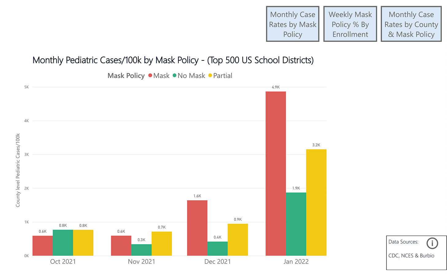
The result of that analysis is below. As you can see, except for a slight edge in October, masked districts fare 2-4x worse than un-masked districts. Why would that be?

Well, it’s not really that hard to figure out. In October of 2021 Southern states—which were more likely to offer mask-optional instruction—were just finishing up their summer case surge. Maskier Northern states hadn’t yet started their winter case surges. But, once the winter wave started to take off, masked-up Northern states started to perform far worse. Not because masks made it better or worse, simply because they made no difference. Seasonality appears to have a far, far greater impact on case rates than any of the non-pharmaceutical interventions we have employed—and certainly more than masks.
Now, if I were using CDC research practices, I would simply ignore the October data I have above, and use the other data where case rates in masked districts sky-rocket during the omicron wave to “prove” that masks make case spread worse. The CDC and others in public health have used this particular trick in countless examples—that is, employing “research” that exploited seasonal differences in case rates—to justify mask mandates and much else. It started with the infamous-to-me MGH study, which used as its “control” an earlier period, and the “intervention period” as the later period, when cases were falling naturally due to seasonality. They did it particularly blatantly in the Kansas mask study, which ignored the period when the data no longer supported their conclusion. And they did it again at the end of last summer when they tried to blame the summer surge on differences in vaccination levels, rather than differential regional seasonality.
However, unlike the CDC, I am not intellectually dishonest. So I will walk you through both the strengths and weaknesses of this data, what it shows, and where we need more information.
First to the strengths. This pattern is remarkably similar to that visible in Emily Oster’s data from the 2020/21 school year, and analyzed by @boriquagato. That is, un-masked schools showed higher case rates early in the year, around October, but later in the year, case rates in masked schools vastly outstripped them. According to Emily Oster, “We do not find any correlations with mask mandates.”
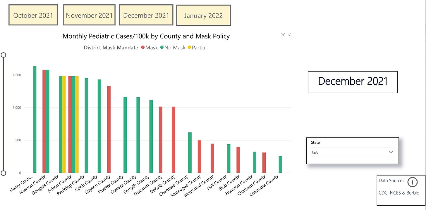
Given this difference in regional seasonality, looking at case rates within a given state is more instructive. The graph below shows Georgia, which has a mix of policies in its districts. Looking at the data, it is clear that there is no pattern where masked or un-masked are uniformly higher. In some counties, like Fulton county, there are multiple policies in place for different districts. Given that the case rates were extracted from the CDC’s monthly pediatric case rates by county, the table below shows the case rates for masked, un-masked and partial districts in a given county as equivalent. Again, this is because we do not have district level pediatric case data, only county level. But we can also see that the vast majority of counties have only one type of policy in place, which suggests this is a reasonable proxy to use.
It would be ideal to have case rates by district, as well as testing rates. But at the moment, this is what we have. You may use the dashboard to explore any state and the difference in pediatric case rates by mask policy in each county. As you do so, you will see that there is no pattern that emerges.
While this conclusion remains at-odds with the CDC’s many gerry-rigged, cherry-picked mask studies, it is in-line with higher quality studies, including the one from Emily Oster cited above. Another study which divorced seasonality from its analysis by looking at the period of case growth, irrespective of when in the year that growth occurred, found no impact from state-level mask mandates. Even the Bangladesh study, which has been widely-touted as being the final “proof” that “masks work”, actually is in-line with this data. This is because while that study reported a 10% relative decrease in infections, most people fail to realize how trivial the absolute difference was, specifically from 0.76% to 0.69%, a difference of less than one-tenth of one percent. When the authors released the raw data, it was found that this amounted to just 20 fewer cases among 340,000 people over the course of four months. Even this number would likely be wiped out, given the myriad flaws in the study.
Interestingly, the CDC’s own meta-analysis of 14 randomized controlled trials (RCTs) found no impact from masks on flu transmission—again, inline with this data. (Meta analyses of RCTs are the highest quality of evidence).
Even the many shoddy mechanistic studies can be viewed to be in-line with this data, if one presumes—as the abstract above implies—that the mechanisms they are testing are wrong. The meta-analysis cited above states a need to better understand the mechanisms of person-to-person transmission, because it is clear that the mechanisms explored and which provided the justification for masks, were clearly not representative of how actual viral transmission occurred.
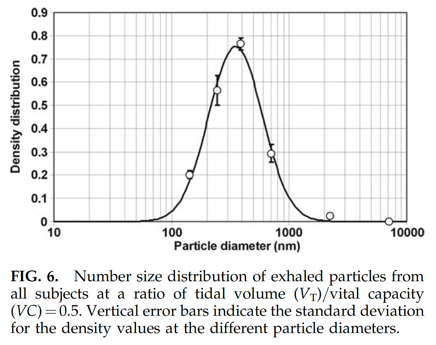
This is likely because the vast majority of the mechanistic studies look at aerosols larger than 5 microns. This despite the fact that since at least 2008 we have known that fewer than 0.1% of exhaled aerosols were larger than 5 microns. While this has not been the focus of research it should have been, since the advent of COVID-19, we now have even more granularity on this. To date, replication-competent virus has only been found in aerosols smaller than 1 micron. Those studies that further sub-divide aerosols below one micron have only found replication-competent virus in the 0.25 - 0.5 micron range. While this may seem odd at first, it becomes less so, when one realizes that less than 1% of the aerosols we exhale are larger than 1 micron.
The respiratory aerosols that carry COVID-19 correspond nearly perfectly to the size of cigarette smoke. The vast majority are below 1 micron, with the majority clustered around 0.28 microns—the average particle size for cigarette smoke is 0.25 micron.

This is significant. Given that we now know that the only aerosols found to carry infectious virus are the same size as cigarette smoke, it means that there is not even mechanistic plausibility for the masks having an impact on case transmission. See the videos below.

Every shred of empirical evidence we have is in line with this. As indeed are the highest quality studies—the RCTs. We jettisoned 100 years of science that showed us that masks did not stop respiratory viruses, and the mechanisms for why that was the case. The only reason we did so, was because Asian nations which masked up quickly early on had lower rates of COVID. All other possibilities for those outcomes were precluded, including the much more logical possibility of some kind of broader pre-existing cross-immunity.
Asians are still wearing masks. Maybe it wasn’t the masks?
Please subscribe for more analysis. I will be doing various follow-on analyses based on this and other data, as well as exploring other harmful aspects of our policy response to the pandemic. You can also follow me on Twitter, @Emily_Burns_V, and look at other analysis I have done on mask research here.


Welcome to Substack, glad to have you here! Looking forward to your continued analysis.
This is one of, if big the most, extensive presentations of the evidence without bias. Being a follower of Daniel
Horowitz and the various Certified Industrial Hygienists he’s had on his podcasts, this information has been available for scrutiny throughout the pandemic. Unfortunately, it takes time and the willingness to exercise critical thinking. The most common response I encounter from the mask cult after presenting this type of objective scientific data has been blank stated and perhaps a “they (masks)myst help a little” or “what’s the big deal? There’s no harm in wearing a mask.” To which I reply, “there isn’t? You know this, how? Share the data you used to come to this conclusion.” End of conversation. Thank you Emily!